Pareto Chart Example of Manufacturing Units
Pareto Chart Example of Manufacturing Units
Pareto Chart Example: Hello Readers! Today we will discuss about the pareto chart principle (80/20 Rule) with manufacturing examples.
DOWNLOAD the Below Example Pareto chart in Excel format.
Pareto Principle (80/20 Rule): –
The 80/20 Rule or Pareto Principle is the most important part of Pareto Analysis. The rule 80/20 says that 80% of the effects come from 20% of the causes.
History of 80/20 Rule: In Italy, Vilfredo Pareto has originally observed that 20% of people were owned 80% of the land. This principle was applied to quality control and favoured the use of the statement of the phrase, which is “The Vital few and useful many” to define the 80/20 rule in the 20th century by Dr. Joseph M. Juran.
Understanding of Principle with Manufacturing Example:
We have taken the major defects related to the Metal fabrication and casting Process. We will analyze the contribution of defects among all with the help of the Pareto principle 980/20 Rule). So, let’s get started with two important examples, details are given below.
Example:
| Defects | Quantity |
| Fatigue | 41 |
| High temp. defect | 37 |
| Mechanical Property degradation | 32 |
| Creep | 28 |
| Env. Interaction | 23 |
| Microstructural changes | 19 |
| Wear | 16 |
| Abbrasive Wear | 12 |
| fretting | 9 |
| Erosion | 5 |
Now, we are supposed to calculate the Cumulative total and Cumulative percentage
| Defects | Quantity | Cumulative Total | Cumulative
in % |
| Fatigue | 41 | 41 | 18% |
| High temp. defect | 37 | 78 | 35% |
| Mechanical Property degradation | 32 | 110 | 50% |
| Creep | 28 | 138 | 62% |
| Env. Interaction | 23 | 161 | 73% |
| Microstructural changes | 19 | 180 | 81% |
| Wear | 16 | 196 | 88% |
| Abbrasive Wear | 12 | 208 | 94% |
| fretting | 9 | 217 | 98% |
| Erosion | 5 | 222 | 100% |
Now, we will plot the Pareto chart and will apply the 80/20 rule to know the 80% contribution among all defects.
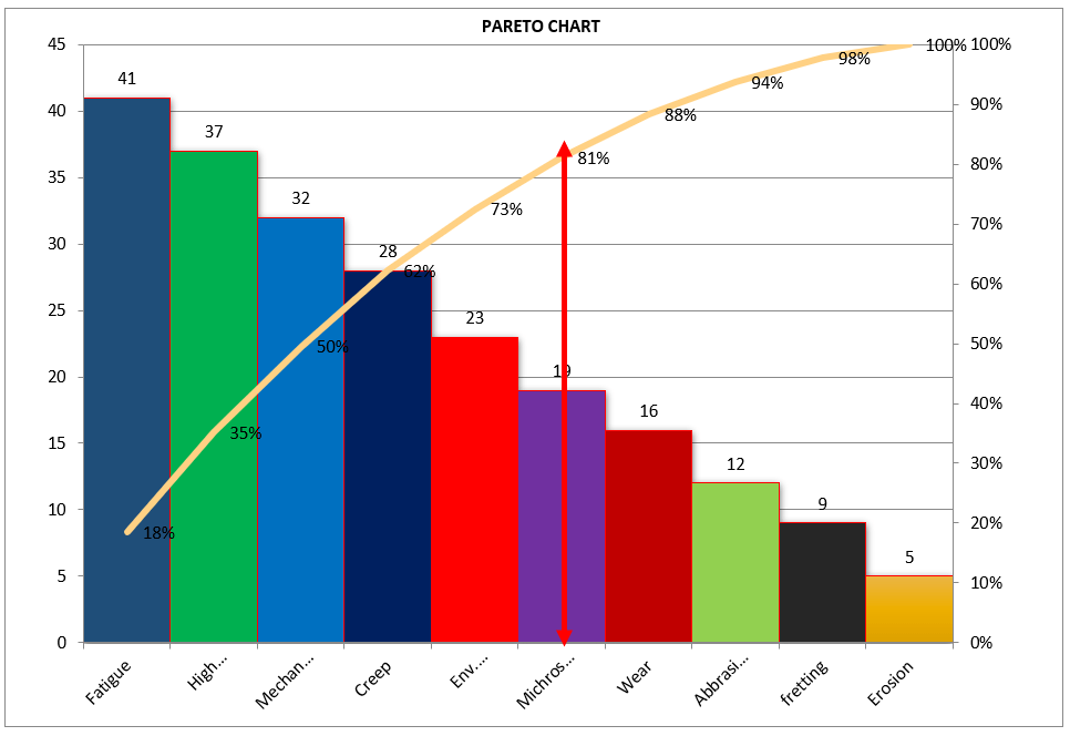
Application of 80/20 rule on the above example: kindly go through the above example and Pareto chart as well, in the aforesaid Pareto chart we have marked by the red color arrow and it is indicating the 80% contribution on a line graph, which means whatever defects are coming under the arrow are contributing the 80% contribution. If you are able to resolve these defects means, your 80% contribution will be solved out of 100%.
I hope the above articles are useful and you people are understood well.
Useful Links:
Histogram Example | Foundry Industries Examples
Histogram Template with example | Download
Repeatability vs Reproducibility | Discussion of Key difference.
Histogram Template with example | Download
More on TECHIEQUALITY
Thank you for reading…. Keep visiting Techiequality.Com
Let us know if you have any questions…
Popular Post:
Related Posts

Run Chart Example | Concept & Interpretation of Result with Case Study | Industrial Example:

How to Plot Scatter Diagram in Excel? | Guides with example | Interpretation
How to make a box plot in excel | Manufacturing Example
About Author
TECHIEQUALITY
The Author is an Expert in Quality Management System, Operation Management, Business Excellence, Process Excellence, IATF 16949, ISO 9001, ISO 14001, ISO 45001, ISO 17025, TQM, TPM & QA. He is a Mech. Engg. & MBA graduate, Certified IA of ISO 9001, IATF 16949, ISO 14001, ISO 17025 & ISO 45001 Standard, lead auditor & BB in 6-Sigma.

